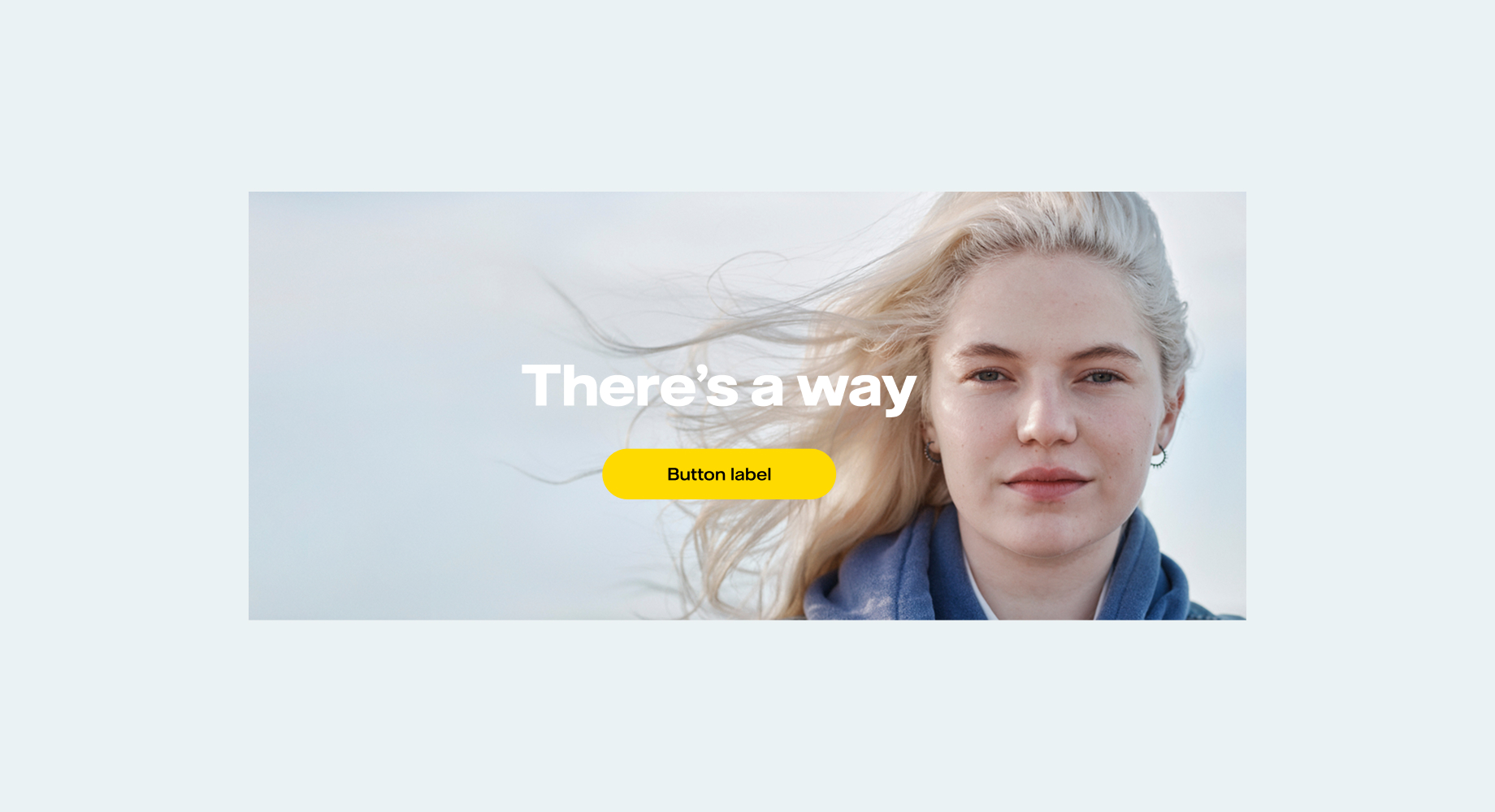
There’s
a way
Project
Project
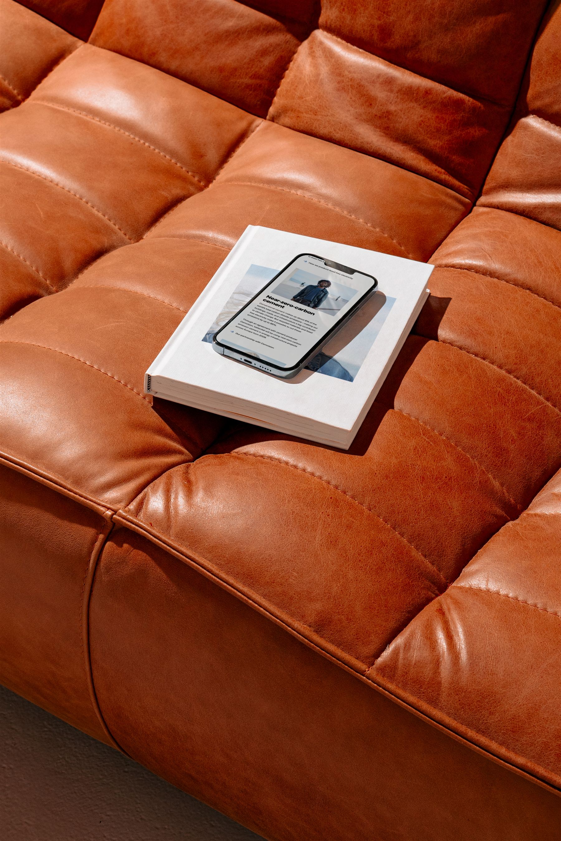
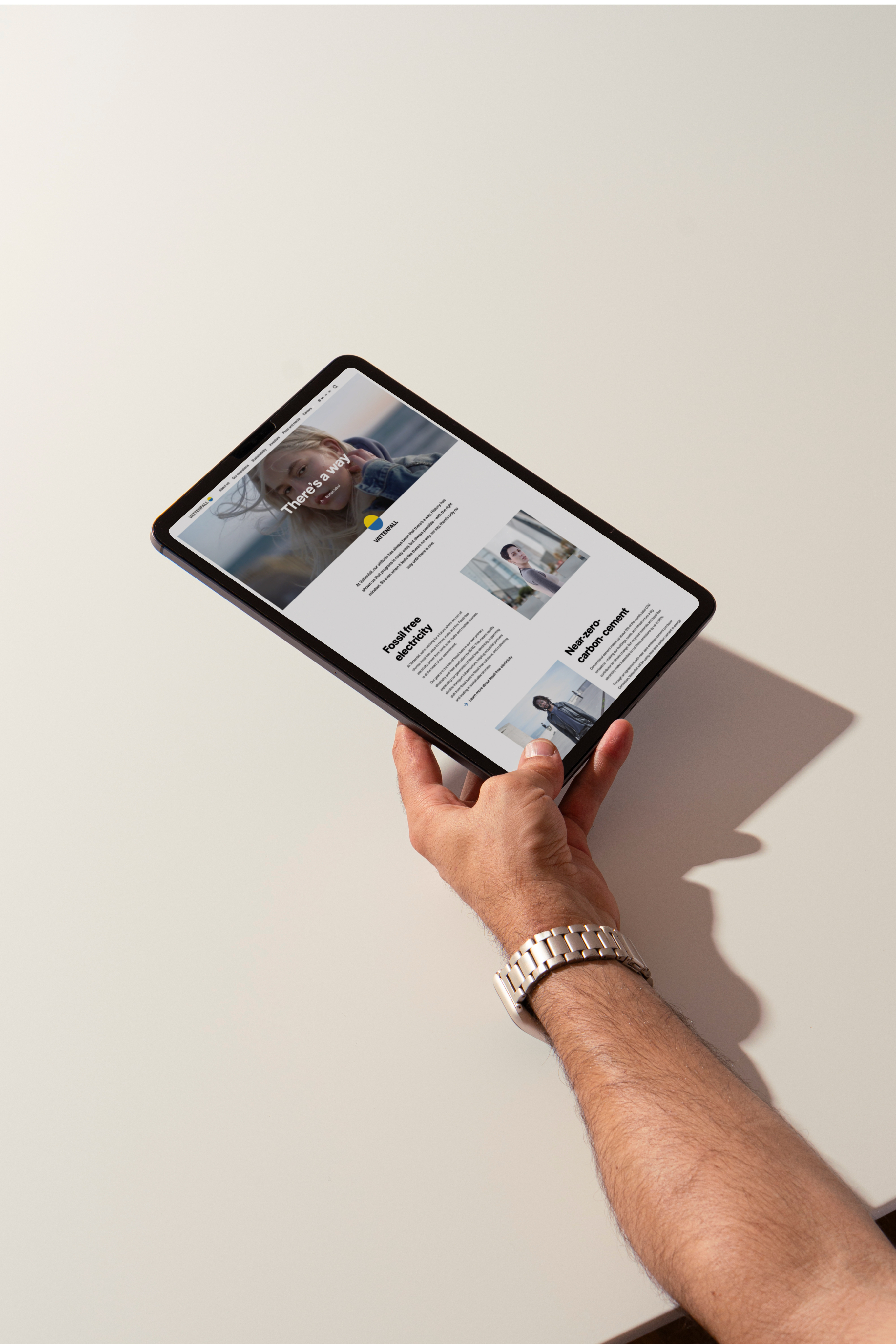
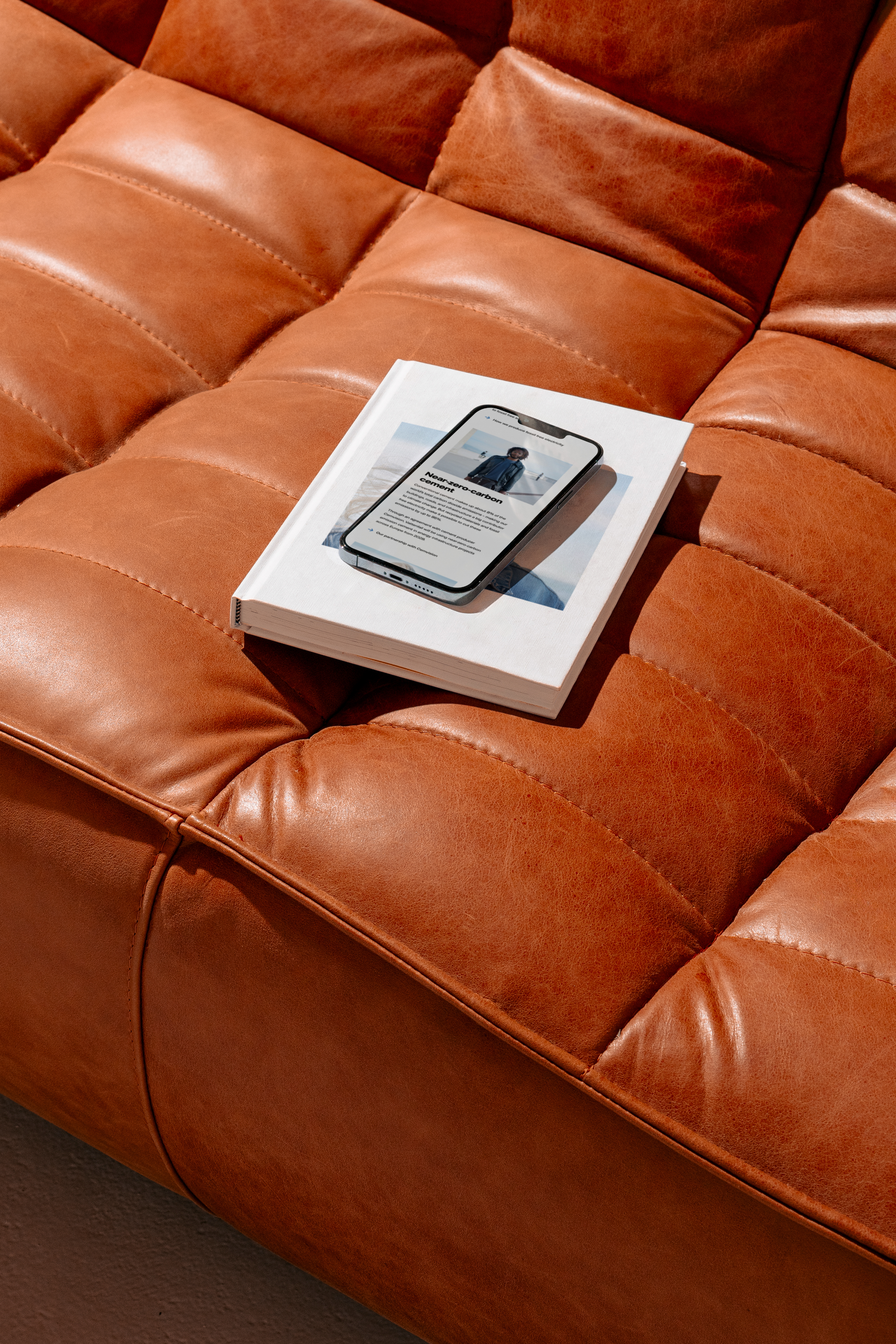
01Vattenfall was launching its new concept, “There’s a way.” With the release came the need for a campaign site that would work across multiple markets, while still feeling 100% Vattenfall wherever it appeared.
Role
02As digital designer, I planned and tested every breakpoint and worked closely with the developers to make the build phase run as smoothly as possible. Because the site launched across multiple markets, I also made sure every module and component could handle longer languages like Finnish and Dutch without breaking the layout.
Client
03Vattenfall is one of Europe's largest producers and retailers of electricity and heat. Owned by the Swedish state, it operates across several European markets with the goal of making fossil-free living possible within one generation.
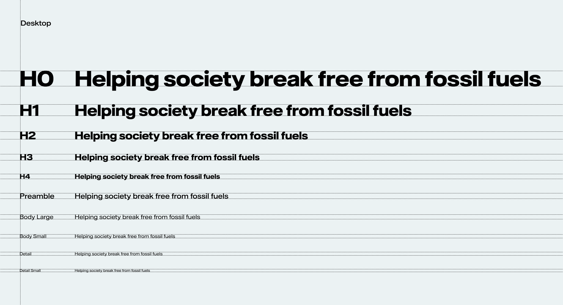
I’m also rebuilding Vattenfall’s design system, creating a foundation where every component, colour and text style is defined and correct. The aim is to give every in-house designer at Vattenfall one true starting point to build from.
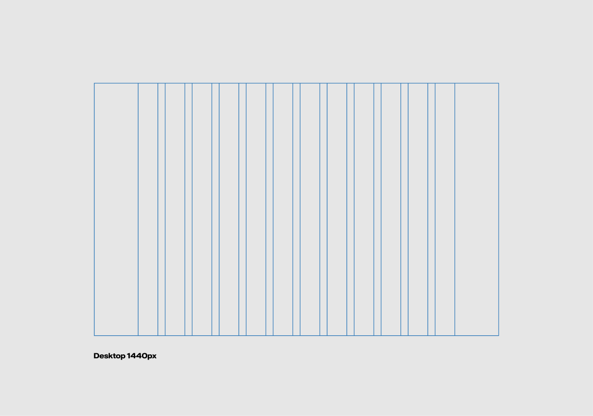
Desktop 1440px